Rebranding
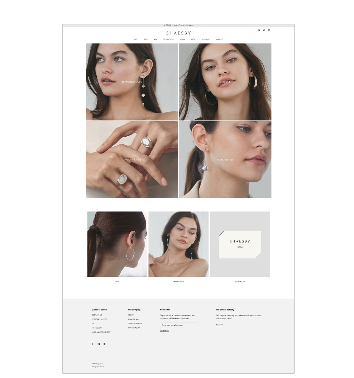
Shaesby presented themselves to us as a modern, everyday luxury jewelry brand who had trouble conveying the luxury and quality of their products to their customers. We helped them by rebranding their logo, product and model photography, and website. We gave the logo some more dimension and emphasis to make it look more superlative than just a name in a default font.
In comparison to their previous product image on flat white background we wanted to add a neutral tone to help with the website and added some natural lighting shadows. For the model images we wanted to keep the idea of using neutral tones but choose cold or warm tones depending on the season of the campaign.
Instead of utilizing their imagery to exhibit their brand, Shaesby’s previous website was heavily text based with amateur photography. With their new campaign and product images we were able to say more about their products without having to read anything in addition to making the site look more modern and cohesive.
Before
After
After (cont.)
Collections Menu
New
Collection
Product
About
Stockist


